

Client
Avanade (Accenture + Microsoft Joint IT Venture)
Timeframe
Jun - Aug 2023 (3 months)
Team
1 PM · 2 Developers · 1 Business Analyst · 1 Visual Designer
Year
2025


Problem
Avanade’s global sales team relies on large volumes of proposals, SOWs, RFPs, and contracts. These documents contain timelines, budgets, and risks—information essential for every sales cycle.
Oltiva AI was created to help reps surface insights instantly, but the initial MVP struggled to guide users into the workflow effectively.
Outcome
Clinician vote passed → advanced to next phase
Project Background
The original demo only looked like AI — it didn’t solve the underlying workflow problems.
When I tested the initial demo, four key issues emerged:

Project Background
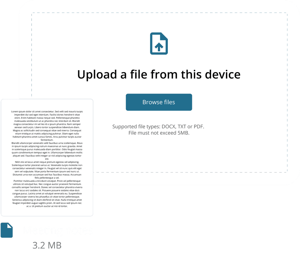
Why the flow must start with uploading a file
For Avanade sales representatives, every task begins with a concrete client artifact — a proposal, SOW, RFP, or contract. Their primary intent in Oltiva is not “explore the tool,” but “get insights from this specific document.”
From a UX perspective, that makes uploading a file the core entry point of the entire flow, not just one option among many.

Iteration 1 😟
Too many actions competing
Showing upload alongside all other actions created confusion about which step starts the flow.

Iteration 2 😟
Cleaner, but still no clear first step
Every option looked equally important, so users still hesitated on the first click.

Final iteration 😎
Make Upload the hero
I made a single primary entry (“Select or upload a file”) visually dominant and pushed the rest into supporting areas, so users immediately knew what to do next.
Iteration 1
Putting “everything on one screen” simplified layouts but reduced clarity.
Hypothesis
One page → fewer clicks → faster process.
Reality
Only 70% task completion.
Sales reps repeatedly said:
“I don’t know where to start.”
The screen was simple, but cognitively overwhelming.
Users needed structure, not a giant empty canvas.
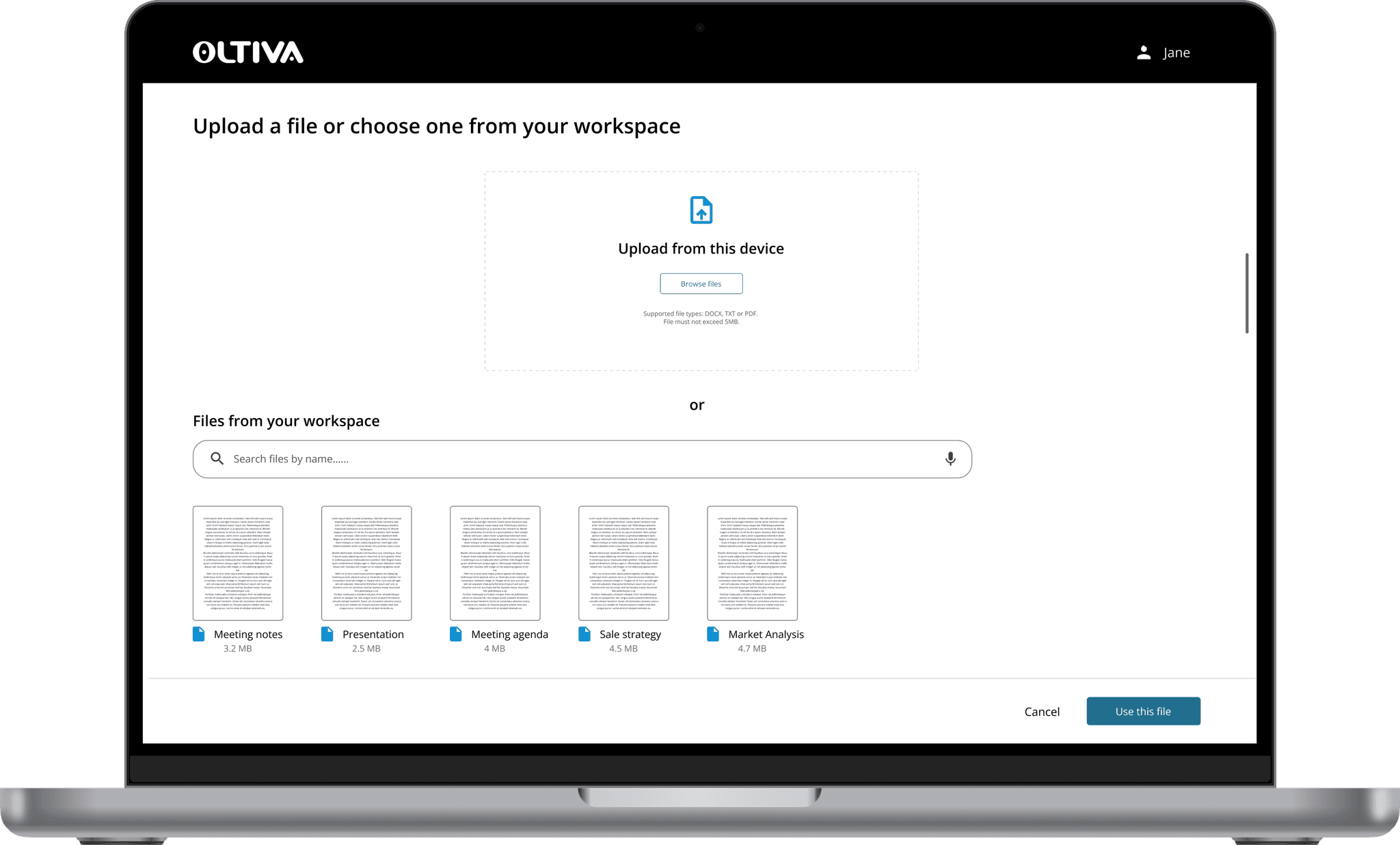
Iteration 2
Giving users a clear starting point immediately improved task completion.
What changed
Added two clear actions:
Upload a file or Select from document hubIntroduced icon + color differentiation
Reduced copy and removed vague instructions
Result
Task completion improved to 75%.
Users finally knew what to do next.
Iteration 3
Giving users a clear starting point immediately improved task completion.
What changed
Added two clear actions:
Upload a file or Select from document hubIntroduced icon + color differentiation
Reduced copy and removed vague instructions
Result
Task completion improved to 75%.
Users finally knew what to do next.
Final Design
A guided AI experience that feels less like “using a tool” and more like working with a knowledgeable assistant.
Feature 1 — One-click file access
Upload from desktop or choose from the enterprise document hub — no digging required.
Feature 2 — Smart AI suggestions
AI pulls out timelines, budgets, dependencies, and decision-critical details.
It also suggests relevant follow-up questions to help reps avoid mistakes.
Feature 3 — Organized for reuse
Every file and conversation is automatically stored in a searchable history, making deals easier to retrace later.
After multiple iterations, we created an experience that is:
Predictable
Guided
Searchable
Consistent
Sales-oriented